You are browsing camaro6 
 10-19-2012, 11:03 AM
|
#1 |
|
The Mark of Excellence

Drives: 2010 ABM 1SS RS LS3 Join Date: Jan 2009
Location: Smallest State in the Union
Posts: 8,690
|
Least favorite Auto Logo
From the C7 Announcement thread where there was some discussion about logos, I started this thread so you can post your least favorite, ugly or non sensical automotive logo.
Here is mine, haven't liked it since I first saw it. Is that supposed to be a "T"?
__________________
BMR, CAI, DynoMax, Elite Eng., Hurst, Jannetty, Clear Image Headers & Hi Flow cats, Jet Hot, LSR, TSW, VMax, Vredestein  |

|

|
|
10-19-2012, 11:22 AM
|
#2 |
|
FAVOR

Drives: Many Different Rides Join Date: Aug 2010
Location: GA
Posts: 783
|
Toyota is a "cowboy"
Nissan is a "hamburger" Least FAV - Chrysler Most FAV - Porsche Best use of Logo - Chevrolet 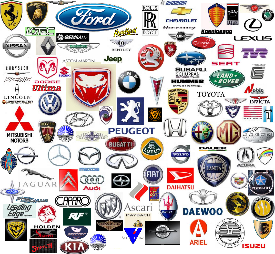
__________________
Please be kind when you drive; thank you.
 |
|
|
|
|
10-19-2012, 11:32 AM
|
#3 |
|
Account Suspend...Right

Drives: Synergy LS & Vulcan 1600cc Join Date: Apr 2011
Location: Lakeland, Florida
Posts: 3,547
|
Im going to get grilled by saying this, and also I design logos for a living, but the chevy bowtie is one of my least favorite auto logos. The first thing I did was debadge my car as soon as I brought it back from the dealership. Looks bland and boring, makes a big impact on the viewer but I'm not a fan of it at all
__________________
 |
|
|
|
|
10-19-2012, 11:36 AM
|
#4 | |
|
FAVOR
Drives: Many Different Rides Join Date: Aug 2010
Location: GA
Posts: 783
|
Quote:
- what I hear you saying is, you need a little more content in a logo. You might be right on, as the survey states that chevy is NOT a top 10 logo - http://www.logodesignworks.com/blog/...-company-logos I enjoy the simplicity of the current chevy logo; plain, no text, easily recognizable. It has changed allot! 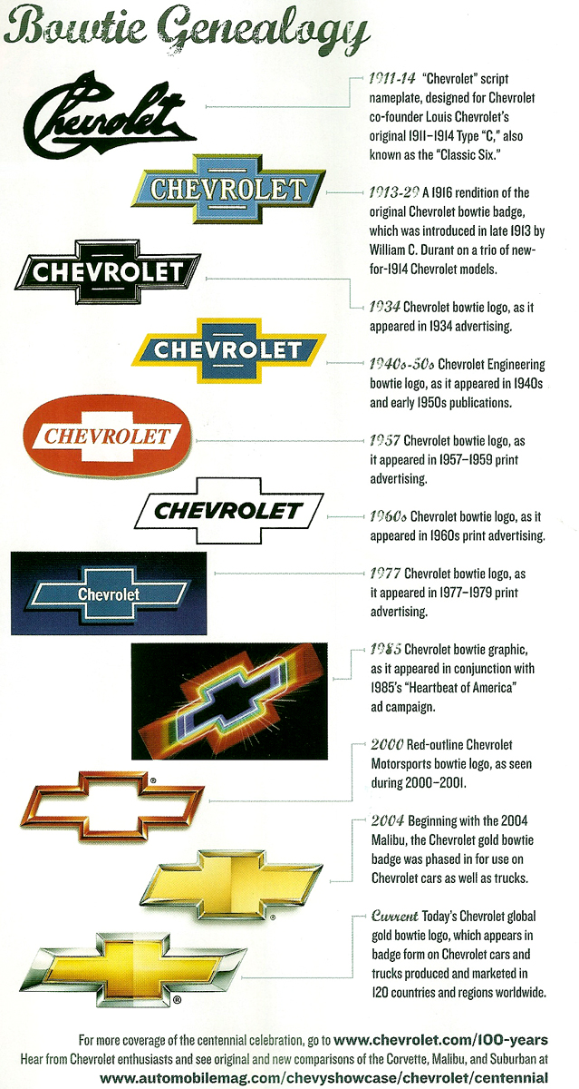 Cadillac is another FAV; again... no text.
__________________
Please be kind when you drive; thank you.
|
|
|
|
|
|
10-19-2012, 04:31 PM
|
#5 |
        Drives: Truck Join Date: Apr 2010
Location: Home
Posts: 2,439
|
I pretty much hate any of them that have the name of the car company in them, i.e Land Rover etc.
The Audi "Olympic Rings" doesn't work either. Infinity is excellent, as is the Impala logo. |
|
|
|
|
10-19-2012, 05:49 PM
|
#6 |
|
Hail to the King baby!

Drives: '19 XT4 2.0T & '22 VW Atlas 2.0T Join Date: Dec 2008
Location: Illinois
Posts: 12,172
|
I read a report once that the badges perceived as the lowest quality were the ones with color.
Chevy - Gold Bowtie Cadillac - see above Buick - Tri Shields have color GMC - even it has RED Badges without color Audi VW MB Toyota Lexus Nissan Infiniti I always thought that the Bow Tie should be a nicely done outline with no color. But that's just me and my opinion. Remember when the red Bow Tie was just an outline???
__________________
"Speed, it seems to me, provides the one genuinely modern pleasure." - Aldous Huxley
|
|
|
|
|
10-19-2012, 06:01 PM
|
#7 |
 
Drives: #null Join Date: Feb 2010
Location: #null
Posts: 335
|
My favorite for logo incorporation/usage is McLaren. Look at the logo (the crescent after the word McLaren) then look at the lights on this McLaren P1. Notice something?

|
|
|
|
|
10-19-2012, 06:33 PM
|
#8 |

Drives: 2012 45th Anniversary SS Coupe Join Date: May 2012
Location: Northern California
Posts: 522
|
I don't mind the bowtie so much myself, but I do agree that it would make a world of difference for the standard bowtie to come in chrome with a body color inset.
|
|
|
|
|
10-19-2012, 08:48 PM
|
#9 |
 
Drives: 2013 Fiat 500 Abarth Grigio Join Date: Apr 2011
Location: Manassas, Va
Posts: 3,124
|
Its hard to choose one fav so ill do two I love the Bugatti logo But only when its EB, And Aston martin.
Least fav is Nissan looks kinda plain even though i do like nissan vehichles. |
|
|
|
|
10-19-2012, 09:23 PM
|
#10 | |
|
Aviation guru

Drives: 10 1SS, 09 Acadia, 90 K1500 Z-71 Join Date: Aug 2010
Location: Tucson, AZ
Posts: 832
|
Quote:
__________________
 |
|
|
|
|
|
10-20-2012, 01:18 AM
|
#11 |
Drives: 2011 Camaro SS/RS - 2004 Silverado Join Date: Mar 2010
Location: Las Vegas, NV
Posts: 2,989
|
My least favorite logo is Hyundai. It's a complete copy of Honda's logo. This is the strategy Hyundai used to develop their logo:
Hyundai Design Team Leader: "Hey, we need to create a logo" Hyundai Design Team Member: "OK, let's just use an italic version of the Honda "H" logo" Hyundai Design Team Leader: "Great idea!!!! Let's go home!"
__________________
2011 Summit White Camaro 1SS/RS
-6.2 LS3, TR6060, 3.45, G80 2004 Black Silverado 1500 2WD Regular Cab, Short Bed -5.3 LM7, 4L60E, 3.42, G80 2014 White Caprice PPV -6.0 L77, 6L80E, 2.92, G80 |
|
|
|
|
10-20-2012, 01:37 AM
|
#12 | |
|
Account Suspended
Drives: 10' IOM 2SS/RS, 13' GB Shelby GT500 Join Date: Sep 2010
Location: Sherwood Park, AB
Posts: 2,180
|
Quote:
 … but then again I'm like him (or as I assume he would be) very anal about the way things from a graphics perspective look… It's one of the reasons I want to take a hammer to that atrocity they call MyLink…. |
|
|
|
|
|
10-20-2012, 08:33 AM
|
#13 |
|
The Mark of Excellence
Drives: 2010 ABM 1SS RS LS3 Join Date: Jan 2009
Location: Smallest State in the Union
Posts: 8,690
|
I like the bowtie, always have, it is just to prominent on the Camaro.
__________________
BMR, CAI, DynoMax, Elite Eng., Hurst, Jannetty, Clear Image Headers & Hi Flow cats, Jet Hot, LSR, TSW, VMax, Vredestein |
|
|
|
|
10-20-2012, 09:23 AM
|
#14 |

Drives: '86 Monte Carlo SS Join Date: Nov 2010
Location: Reno, NV
Posts: 3,119
|
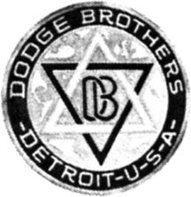
Pre-1938 Dodge vehicles had the Star of David in it's logo. Certainly one of the most unusual logos.
|
|
|
|
|
Post Reply
|
|
|